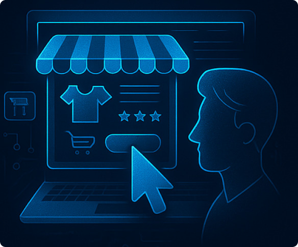
Online store design: how to make your website attractive and functional
4.8
11
Online store design: how to make your website attractive and functional
Almost anyone can launch an online store today: a couple of clicks and you already have a template with a catalog on your hosting. But making sure that the site doesn’t just hang around on the Internet, but brings in steady orders, is a completely different matter. Here, every design decision works like an attentive sales consultant. It draws the eye to the right button, removes unnecessary steps, and builds trust even before the first click.
Just reload the page to feel the difference. The lively interface welcomes you with a clear menu, shows the benefits of promotions without pop-up distractions, and honestly states the delivery price. In a few seconds, the visitor makes an internal decision: “I feel comfortable here.”
“A beautiful but confusing page scares people away faster than any loud discount can get them interested,” reminds Yevhen Kasyanenko, leading expert at KISS Software.
That’s why we treat design as a system of fine-tuning. We study the audience, think through the route from the first screen to payment, and test every detail. When everything is done right, the store starts selling itself—without unnecessary persuasion or lost customers.
A website that sells: from design to results
Leave a request — we’ll help you build an online store users love to return to.
Why is the design of an online store so important?
The user lands on the page and decides in the first few seconds whether to stay or leave. The design of an online store sets the tone for this choice, so it is important to know what mechanisms influence it.
Below, our expert has highlighted the key factors that we control, and immediately after the list, we will summarize their impact on sales:
Convenient navigation and a structured menu. A clear hierarchy of categories and predictable sub-items save time.
Visual hierarchy of elements. Contrast, size, and space set priorities and lead to the CTA button.
Optimal decision-making speed. The fewer unnecessary clicks, the higher the chance of completing a purchase.
Obviously, when navigation is easy, attention is not scattered, and the path to payment is short, conversion increases by 10-30% without additional traffic costs.
The main stages of creating an online store design
Before you start drawing layouts, it is important to lay the foundation. You need to understand who will be using the store, what the buyer expects, and how they make purchasing decisions. Our team collects this data, builds the logic of the pages, and only then moves on to the visuals. This order allows us to avoid beautiful but useless solutions and immediately focus on what really increases conversion.
Target audience analysis
Before sketching the first web design for an online store , we study the people for whom the interface is being designed. Understanding buyer motivation helps us hit the mark from the very first screen. To do this, it is important to answer the following key questions:
Customer goals. Price, brand, product uniqueness, or delivery speed?
Barriers and fears. Complicated registration, unclear warranty, long delivery times?
Context of use. Desktop at home, smartphone on public transport, or tablet on the sofa?
“Accurate audience profiling is the foundation on which the best online store designs are built,” says our expert.
Developing structure and prototypes
The skeleton of the site is a map of screens and a clickable prototype that allows you to quickly test hypotheses. After testing, we remove the unnecessary so that the user can navigate without pauses or hesitation.
Corporate identity and visual design
The corporate palette and font pair create brand memorability. In the example of online store design, we adhere to one simple rule: three basic colors and one accent for buttons and discount badges. After all, unique icons and delicate animation make the store recognizable, not flashy.
Functionality and usability
Small but thoughtful details eliminate minor irritants that often cause shoppers to abandon their carts. It is important to work on:
Instant filters and search without reloading.
Adaptability to any screen – from a 4-inch smartphone to a 27-inch monitor.
Quick checkout, where the address and zip code are filled in automatically.
These three points reduce purchase time and increase loyalty even among impatient visitors.
Online store home page design: key elements
The home page sets the tone for the entire store. This is where visitors instantly see the product range, promotions, and level of reliability. Below are the elements that organize this first frame and smoothly lead the buyer to the “Add to cart” button.
Header (website header) and main menu
The top panel should always keep four key elements in front of the user’s eyes: logo, search, contacts, and shopping cart. Fix the header on the screen so that navigation remains accessible even when scrolling down.
Product catalog: convenient navigation
A clear hierarchy from general to specific helps the customer reach the desired section in two or three clicks. Drop-down menu levels are combined with quick links “Show similar,” and filters by brand, price, and characteristics allow you to narrow down your selection in seconds. We avoid vague sections, because the buyer should understand exactly where they are and what they will see next.
Advertising blocks, promotions, and special offers
Two bright banners on the first screen and a small timer are enough to show the relevance of the offer.
“The fewer elements distract from the catalog, the higher the clickability of the banner,” notes Yevhen Kasyanenko.
We make sure that the total weight of the graphics does not slow down the loading speed—excessive animation reduces CTR and causes irritation.
Want your design to drive sales?
We know how to turn your online store into a beautiful and user-friendly sales tool. Leave a request and get a design consultation.
Social proof works better than any slogan. We add “Hit,” “NEW,” star ratings, and short reviews of up to 100 characters.
“Showing current sales removes doubts among new visitors and speeds up their choice,” emphasizes Yevhen.
Trust block: reviews, guarantees, certificates
Users are more willing to pay when they see clarity and transparency. We place:
real reviews (text and customer name);
payment system and bank logos;
a “14-day return” icon.
“The main thing is that everything is in the first scroll zone, then trust is formed instantly,” advises the KISS Software expert.
Footer (bottom of the website)
At the bottom of the page, the user expects to see service links. We place contacts, privacy policy, delivery terms, and a subscription form.
“A clear footer structure saves visitors time and reduces the number of support questions,” sums up Yevhen Kasyanenko.
Design of key pages of an online store
Once a visitor is interested in the Home page, they move on to internal pages—product cards, shopping cart, personal account. This is where the fate of the purchase is decided: is there enough information, is it easy to change the quantity, is the final receipt clear? We focus on making every click logical and unambiguous: concise descriptions, clear CTA buttons, and transparent order steps.
Product page: how to make the description convincing
The final point of decision-making is the product card. Here it is important to answer any remaining questions and build trust at a glance:
Gallery of 4-5 photos, videos can be added, enlarged by clicking.
Advantageous description: don’t just write 100% cotton, but be more specific, for example, breathable fabric, the child will not overheat.
Reviews, ratings, number of questions and answers – social proof.
The “buy” button should be large and contrasting so that it is visible without scrolling.
Our experience shows that a concise but comprehensive card increases CR by 8-12%.
Shopping cart and order design
The shopping cart should serve as a final check before payment, not turn into a quest. Our task is to shorten the path to the “confirm” button so that it takes just a couple of simple steps to get there. The following will be useful for the shopping cart:
Instant editing of items. Changing the quantity or deleting an item should happen without reloading.
Guest checkout. The ability to buy without registering will be useful for those who do not want to create an account.
Checkout on one page. It is better to collect contact details, address, delivery method, and payment information in a single form with a minimum number of fields.
Transparent terms and conditions. Delivery costs and times should be displayed immediately, with no hidden fees.
“If the entire process takes less than two minutes, the number of abandoned carts decreases significantly,” notes our specialist.
User account
A convenient user account is your comfort zone for the buyer after placing an order. It will display:
Order history. A couple of clicks and the previous set of products is back in the cart.
Wish list. Saved items will not disappear: the system will tactfully remind you of them on your next visit.
Recommendations. Based on past purchases, the account offers items that may be of interest to the customer.
When all the necessary functions are at hand and there are no distractions, it is easier for people to return for repeat purchases, and the average check grows by itself.
Online store design mistakes to avoid
Aesthetics alone will not save sales. If a website becomes inconvenient, customers will leave. We have identified four common mistakes that regularly come up in our audits and added practical tips on how to fix them before they hit your bottom line.
Visual noise and page overload
When banners of different sizes flash across the first screen, the buyer’s brain looks for a way out, not the “buy” button. Leave one or two accents and remove unnecessary elements.
“The first screen should be concise and clear, without visual chaos,” emphasizes Yevhen Kasyanenko.
Excessive use of animation and pop-up windows
Animation is useful when it directs attention, highlights the “buy” button, shows the addition of a product to the cart, and smoothly reveals filters. But if every block flashes or windows with hot offers pop up on the screen every minute, the user loses control of the page and closes the tab. Here are some simple tips:
Limit pop-ups to 1-2 scenarios. For example, a discount on the first visit and a reminder about an abandoned cart is enough.
Use light CSS animations instead of heavy scripts so as not to slow down loading and drain mobile batteries.
Maintain accessibility. Animation should stop according to the Reduce Motion system setting.
“If it’s difficult for a designer to explain why an effect is needed, it’s most likely excessive,” adds our expert.
Insufficient contrast and complex fonts
Text is the main carrier of meaning. Light gray letters on white, ornate decorative fonts, and 11px microtype make viewing a challenge. Therefore:
Contrast should be no less than 4.5:1 for the main text and 3:1 for secondary elements.
A font pair for the headline and text, as well as accent typeface and everything else, is sufficient for the entire page.
CTA buttons should stand out visually in terms of color and size, not with a thin border.
Remember that poor readability is one of the reasons why visitors leave a website without understanding how to place an order.
Lack of mobile adaptation
Smartphones are the main traffic channel for most online stores. If the site opens with horizontal scrolling, the buttons are smaller than your finger, and the order form slides off the edge, the user will return to the search in seconds. To prevent this from happening, pay attention to the following aspects:
Mobile-first approach. Design the interface for 360 px width first, then scale up.
Touch targets 44 × 44 px is the minimum button size according to Google’s recommendations.
Simplified checkout, auto-fill address, saved payment methods, and touch instead of click.
Speed optimization. Core Web Vitals are important not only for SEO, but also for retaining users on 4G networks.
“The buyer will not zoom in on the page to reach the button. They will open a competitor’s website where everything works without unnecessary movements,” summarizes Yevhen Kasyanenko.
Conclusion
A well-thought-out design for an online store is not just a beautiful page, but a real sales driver. It speeds up the path to purchase, reduces the number of abandonments, and helps the customer feel confident at every step.
“The first 15 seconds determine whether a person will stay on the site or close the tab,” our expert reminds us.
At KISS Software, we work on a full cycle:
we research the audience;
we build prototypes;
we implement the design;
we check the results;
we refine the details.
As a result, you get an online store that is not only pleasing to the eye, but also really pushes buyers to make a purchase. If your website needs a design refresh or you are just getting started with online sales, let KISS Software know.
We will conduct a free audit, outline steps for improvement, and turn your design into a working lever for growing your online store’s sales — submit a request for a consultation right now!
Ready to upgrade your store’s design?
A high-converting site is the result of precise UX/UI work. Leave a request, and the KISS Software team will offer a solution tailored to your niche.